
How Fleet Heatmap Visualization Reveals Hidden Hotspots
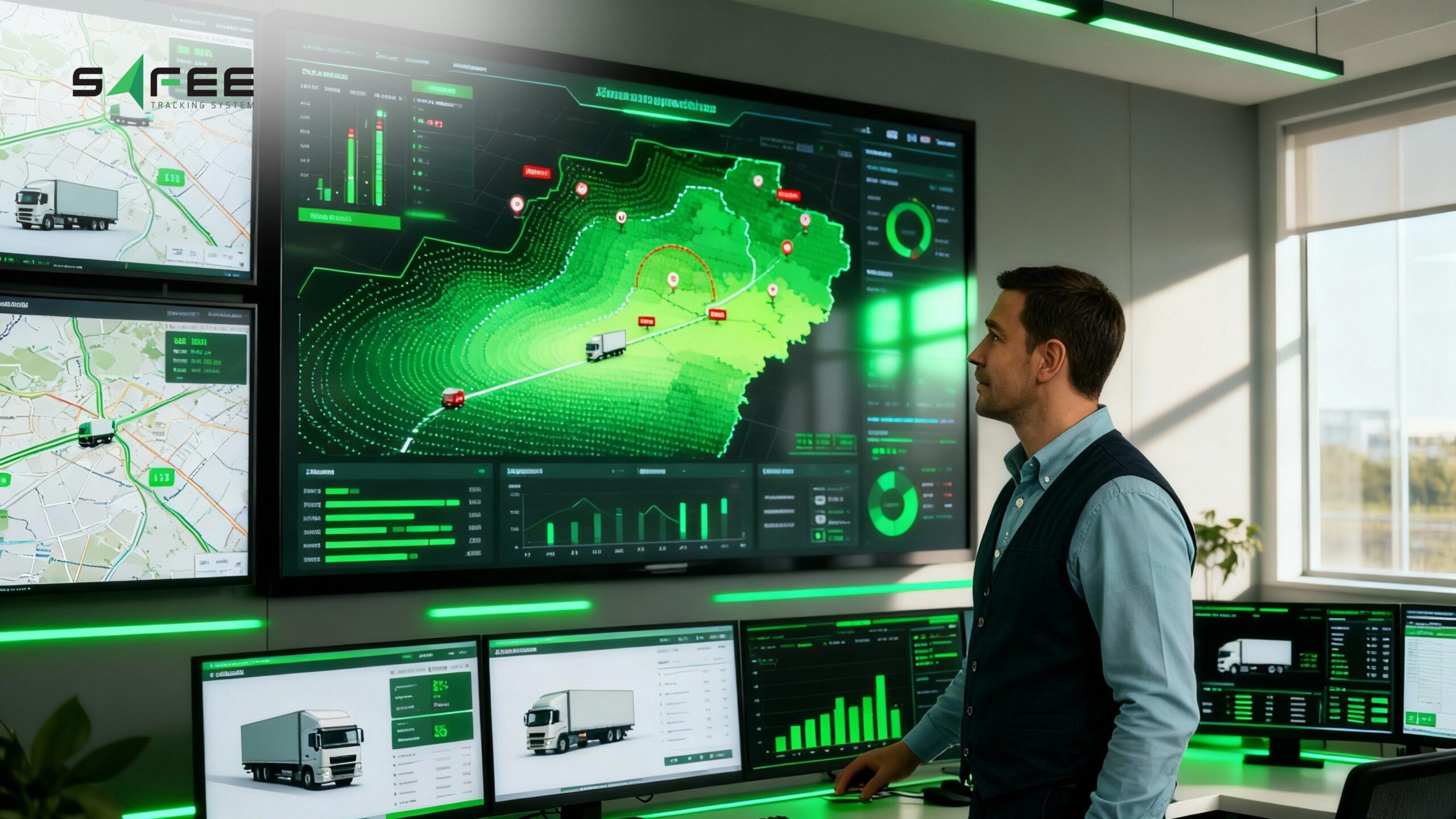
Stop relying on assumptions. If your current GPS fleet monitoring only shows individual vehicle trails, it may be hiding the broader patterns behind your fleet’s activity. Safee’s heatmap visualization transforms historical GPS and telematics data into a clear, color-coded fleet heatmap, helping logistics and transportation managers identify vehicle hotspots, idling zones, congested routes, and areas where vehicles repeatedly spend time. This approach to fleet data visualization makes recurring operational patterns easier to understand and supports more informed fleet optimization decisions.
This article introduces Safee’s heatmap visualization feature—the dynamic analytical tool built for precision fleet management. We will detail how this solution translates massive location data into actionable insights, showing you the exact mechanisms for effective data visualization for fleets, and how our advanced controls ensure you achieve unparalleled efficiency in your fleet mapping and deployment strategy.
What is a heatmap in fleet data visualization?
A heatmap visualization is an analytical map layer that uses color gradients to show the concentration of vehicle activity across a geographic area. Unlike standard fleet mapping, which displays individual vehicle positions or trails, a fleet heatmap combines GPS location points collected over a selected period to reveal recurring activity patterns. Warmer colors, such as red, indicate areas with higher vehicle density, while cooler colors represent lower levels of activity. This approach to fleet data visualization helps managers identify hotspots, frequent stops, and low-activity zones without reviewing large volumes of raw location data.
What does Safee’s fleet heatmap visualize?
Safee’s fleet heatmap visualizes where vehicles cluster, stop, idle, and move most frequently during a selected period. By aggregating GPS and telematics data, it creates a clear vehicle density map that helps fleet managers identify high-activity waiting areas, frequently served delivery zones, recurring route bottlenecks, and locations with limited fleet activity. This fleet activity heatmap makes it easier to visualize fleet trends and understand how vehicles and resources are distributed across routes, depots, and service areas, providing a stronger basis for route planning, scheduling, and resource allocation.
ِAlso read: Best Fleet Fuel Management System for Smarter Operations in 2026
What fleet data is best visualized by heatmaps?
Fleet heatmaps work best with geographical and time-based telematics data that reveals recurring activity patterns across routes and service areas. Safee can aggregate GPS coordinates, stop duration, ignition status, idling periods, speed ranges, and visit frequency over a selected timeframe. This approach to fleet telematics data visualization helps managers identify vehicle clusters, repeated waiting points, heavily used delivery zones, and areas with limited fleet activity. Instead of reviewing thousands of individual tracking records, teams can use the heatmap to support route analysis, scheduling, vehicle deployment, and asset utilization decisions.
What is the main purpose of a fleet heatmap?
The main purpose of a fleet heatmap is to turn recurring vehicle activity patterns into visual evidence that supports better operational decisions. By showing where vehicles repeatedly cluster, wait, idle, or travel, it enables fleet optimization with heatmap analysis across routes, delivery zones, schedules, and vehicle allocation.
Managers can use these insights to identify areas that require further investigation, validate whether resources are distributed effectively, adjust routing plans, and reduce avoidable idle time. The heatmap does not make decisions automatically; it highlights patterns that teams can compare with journey, fuel, and operational data before taking action.
Request a personalized Safee demo to see how fleet heatmap insights can support your routing and resource-planning decisions.
Also read: Safee Vehicle Fleet Management Software for WASL Compliance
How heatmaps reveal operational inefficiencies?
Fleet hotspot analysis uses aggregated historical location data to reveal areas where vehicles repeatedly cluster, stop, or move at low speeds. Safee’s fleet heatmap makes these recurring patterns easier to identify than standard GPS fleet monitoring, which generally focuses on individual vehicle locations and trails.
A high-density area does not automatically prove that an operational problem exists. It may represent a busy depot, an important customer location, or a planned service zone. However, repeated concentration around loading docks, congested roads, delivery points, or unplanned waiting areas can indicate issues that require closer investigation.
Fleet managers can compare these hotspots with journey schedules, geofences, delivery windows, stop durations, and driver activity to determine their likely causes. The findings may support decisions such as redistributing routes, staggering dispatch times, revising delivery schedules, or allocating vehicles more effectively across service areas.
This turns the heatmap into a focused diagnostic tool: it shows managers where to investigate first, while operational records provide the context needed to decide what should change.
How to reduce fleet idle time using heatmap data?
Safee’s fleet heatmap can help managers identify recurring fleet idling zones by combining location data with the Ignition Status filter. Selecting engine-on records makes it easier to distinguish areas where vehicles remain stationary with the engine running from locations where they are simply parked or inactive.
Managers can filter the analysis by vehicle, group, and date range to determine whether idling is linked to specific routes, drivers, depots, customer sites, loading areas, or periods of the day. These patterns should then be reviewed alongside journey schedules and Safee’s fuel tracking and control data to understand their operational and fuel impact.
Depending on the cause, businesses may use the findings to:
- Adjust delivery or loading time windows.
- Improve dispatch and queue-management procedures.
- Coach drivers on unnecessary engine-on waiting.
- Redesign routes around recurring congestion.
- Coordinate more effectively with customer and depot teams.
A heatmap does not reduce idle time automatically. It provides the location and timing evidence needed to target corrective action. By reviewing the same zones after changes are introduced, managers can determine whether idling patterns are improving over time.
Safee’s heatmap feature for advanced fleet optimization
Safee’s heatmap visualization feature adds a focused analytical layer to the platform, helping fleet managers turn aggregated GPS and telematics data into practical operational insights. Designed for fleet data visualization, it highlights recurring vehicle-density patterns that may be difficult to detect through standard GPS fleet monitoring alone.
Managers can use the feature to examine where vehicles cluster, wait, idle, or repeatedly travel during a selected period. These patterns can then be compared with routes, schedules, delivery zones, geofences, and other fleet records to support better resource allocation and operational planning.
Rather than promising immediate improvements automatically, Safee’s fleet heatmap gives teams clearer evidence for investigating inefficiencies and deciding where routing, scheduling, driver management, or vehicle deployment may need adjustment.
What Safee’s fleet heatmap visualization offers?
Safee’s heatmap visualization converts aggregated GPS and telematics data into a clear analytical layer for reviewing fleet activity by location and time. Compared with examining individual vehicle trails through standard GPS fleet monitoring, the fleet heatmap makes recurring patterns—such as vehicle clustering, frequent stops, and low-speed zones—easier to identify and investigate.
What Safee Offers | How It Works | Operational Value |
Fleet Activity Visualization | Safee aggregates location records from selected vehicles and displays them as a color-coded fleet activity heatmap for the chosen analysis period. | Managers can visualize fleet trends, identify frequently visited delivery zones, recurring waiting areas, and locations where vehicles spend more time than expected. These insights support scheduling and vehicle-allocation reviews. |
Vehicle Density Mapping | The system groups GPS data points according to their geographic concentration. Warmer colors indicate higher activity density, while cooler colors represent areas with less recorded activity. | The resulting vehicle density map helps teams compare depots, service areas, routes, and potential bottlenecks using measurable activity patterns. Managers can then examine these locations alongside journey, fuel, and operational records before making changes. |
Safee’s fleet data visualization does not automatically prove that every high-density area is inefficient. Instead, it shows where further investigation may be valuable, helping teams focus route analysis, scheduling reviews, and resource-planning decisions on the locations with the most significant recurring activity.
Request a Safee demo to see how the fleet heatmap can support route analysis, resource allocation, and operational planning.
Also read: Why Small Businesses Need Fleet Management Solutions
Real-world fleet heatmap use cases across the MENA region
Fleet operations across the MENA region range from dense urban delivery networks to remote industrial routes. Safee’s fleet heatmap visualization helps managers examine how vehicle activity is distributed across these different environments and identify locations that deserve closer operational review.
The heatmap should not be treated as proof that every high-density area represents inefficiency. Its value comes from showing recurring patterns that managers can compare with routes, schedules, geofences, delivery records, and other operational data.
Logistics and distribution
Logistics companies can use fleet hotspot analysis to compare vehicle concentration across depots, loading areas, distribution hubs, customer zones, and frequently used routes.
Repeated clustering at a warehouse entrance or loading point may indicate scheduling overlap, queueing, or limited loading capacity. Managers can review these patterns by time and vehicle group before adjusting dispatch schedules, route allocation, or loading appointments.
The same analysis can reveal delivery territories where several vehicles repeatedly overlap, helping teams assess whether routes and resources are distributed according to actual demand.
Oil and gas operations
Oil and gas fleets often operate between base camps, depots, remote sites, and controlled travel corridors. A fleet heatmap can display recurring movement and stopping patterns across these locations over a selected period.
Managers can compare high-density areas with approved geofences, planned journeys, and historical routes to investigate repeated stops, unexpected clustering, or excessive waiting around specific sites.
The heatmap alone cannot confirm that a stop was unauthorized or unsafe. It identifies where further review may be required, while journey records, driver information, and operational context help determine the cause.
Last-mile delivery
For last-mile fleets operating in cities such as Riyadh, Dubai, or Cairo, a vehicle density map can reveal where drivers repeatedly wait near apartment complexes, shopping centers, pickup points, or high-volume customer zones.
These patterns can be compared with delivery status, time windows, failed-delivery records, and proof-of-delivery data to determine whether waiting is caused by access restrictions, customer availability, parking limitations, or inefficient scheduling.
Operations teams may then adjust delivery windows, driver allocation, route sequencing, or customer communication procedures. Safee’s broader last-mile solution supports route planning, real-time delivery visibility, dispatch workflows, and proof-of-delivery records that can provide additional context for this analysis.
Government and municipal fleets
Government and municipal organizations can use vehicle density mapping to review how fleet activity is distributed across districts, service zones, public facilities, or scheduled routes.
The heatmap may highlight areas receiving frequent vehicle activity and locations with comparatively limited coverage. These patterns should be assessed against service demand, assigned responsibilities, schedules, and operational priorities before concluding that an area is over-served or under-served.
This can support more structured reviews of vehicle deployment, district coverage, shift planning, and public-resource allocation.
How Safee’s fleet Heatmap connects with the wider fleet management ecosystem
Safee’s heatmap visualization becomes more useful when its density patterns are interpreted alongside other fleet-management data. The heatmap shows where recurring activity occurs, while tracking, journey, fuel, alert, and reporting tools help managers investigate when it happened, which vehicles were involved, and what operational conditions surrounded it.
Live tracking and fleet monitoring
Historical heatmap patterns can be compared with live vehicle tracking and Safee’s fleet monitoring and insights tools. Managers can move from identifying a recurring hotspot to reviewing the current locations, status, drivers, paths, and alerts associated with vehicles operating in that area.
Safee’s monitoring environment includes live and historical views, route and geofence tools, vehicle-status filters, event histories, and access to connected fleet applications.
Geofences and journey records
Displaying geofences over the heatmap allows managers to compare activity density with depots, customer sites, restricted zones, approved routes, and operating boundaries.
Journey records can then provide additional context, helping teams determine whether a hotspot reflects planned stops, route deviations, congestion, loading activity, or another operational condition.
Fuel monitoring and idling analysis
Heatmap areas generated through engine-on or low-speed filters can be compared with Safee’s fuel data to assess whether recurring waiting zones are associated with elevated idle consumption.
Safee’s fuel-management tools record idle fuel usage, trip consumption, refueling activity, fuel-level changes, and historical trends. Combining these records with heatmap patterns gives managers a more reliable basis for investigating fuel waste than location density alone.
Alarms, events, and fleet reports
Managers can compare recurring hotspots with alarms, geofence events, speeding records, route deviations, and scheduled fleet reports. This helps determine whether a location is linked to a one-time event or a pattern that appears across several vehicles or operating periods.
Reports also allow teams to document the issue, assign corrective actions, and review whether the pattern changes after routes, schedules, or procedures are adjusted.
Delivery and field-service workflows
For delivery operations, heatmap insights can be reviewed alongside order status, route plans, stop completion, driver tasks, and proof-of-delivery records. This helps teams distinguish between high activity caused by genuine customer demand and concentration created by delays or workflow problems.
This connected analysis makes the fleet management analytics dashboard more valuable than an isolated map view because each density pattern can be examined within its wider operational context.
For fleets using regional compliance integrations such as WASL or Madinati, heatmap findings may support internal operational reviews alongside those workflows. However, the heatmap itself should not be presented as an official regulatory report unless a specific reporting process has been technically confirmed.
By connecting fleet data visualization with monitoring, journeys, fuel, alerts, and reporting, Safee helps managers progress from locating recurring activity to understanding its likely causes and deciding which operational changes should be tested.
Ready to transform your fleet operations? Contact Safee today to request a demo.
How to start using Safee’s fleet Heatmap visualization?
Safee’s fleet heatmap visualization is a permission-based feature that can be added to your existing fleet management workflow. Access should be enabled only for users who are responsible for monitoring, analysis, or operational decision-making.
To start using the feature:
1. Enable heatmap access
Your company administrator must enable the Heatmap permission under the Monitoring permissions category in the Safee administration settings.
2. Open the heatmap tool
Once access is enabled, a heatmap icon will appear on the map within the main monitoring page. Selecting this icon opens the dedicated heatmap analysis interface.
3. Define the analysis scope
Choose the vehicles, groups, and date range you want to analyze. Safee will use the selected GPS and telematics records to generate a customized fleet mapping view based on your operational needs.
4. Apply filters and review the results
Use the available filters to refine the visualization by factors such as speed, ignition status, geofences, radius, and opacity. These controls help you focus the analysis on specific fleet behaviors, locations, or time periods.
After the heatmap is generated, compare the identified density patterns with journey records, delivery schedules, fuel activity, and other operational data before making routing or resource-allocation decisions.
To move beyond basic GPS fleet monitoring and begin using visual fleet analytics, contact your Safee account manager to confirm that the Heatmap permission is enabled for your company.
If you are ready to move from basic GPS fleet monitoring to powerful visual analytics, contact your Safee account manager today to ensure the Heatmap permission is enabled for your company.
How to filter and customize your fleet heatmap for deeper analysis
Safee’s fleet heatmap can be refined to focus on specific vehicles, periods, operating conditions, and geographic areas. These controls help managers move from a general density view to a more targeted analysis of routes, vehicle activity, idling patterns, and recurring operational hotspots.
Effective fleet optimization with heatmap analysis begins by defining the scope of the data before interpreting the results.
Initial filtering and setup
Vehicle Filter (Level Filter): Select the vehicles, groups, departments, or asset types whose data you want to include. Multi-selection makes it possible to compare activity patterns across different parts of the fleet.
- Date Filter: Choose the period you want to analyze. A defined date range helps ensure the heatmap reflects the relevant shift, day, week, campaign, or operational cycle.
- Filter Button: Apply the selected criteria to aggregate the relevant GPS and telematics records and generate the customized fleet heatmap.
Advanced customization tools
Once the heatmap is generated, Safee provides powerful additional actions to refine your investigation and compare data sets directly on the map. These tools confirm Safee as a leading solution for data visualization for fleets:
Action | How It Is Applied | Operational Benefit |
Integrate Geofences | Display existing geofences over the generated heatmap. | Compare vehicle density with depots, delivery zones, customer sites, restricted areas, or approved operating boundaries. This helps teams investigate repeated activity inside or outside defined zones. |
Speed Scroller | Limit the displayed data to a selected speed range. | Support fleet route heatmap analysis by distinguishing higher-speed movement from slow-moving traffic, congestion, waiting, or repeated low-speed activity. |
Ignition Status Selector | Filter records according to whether the vehicle ignition was on or off. | Identify potential fleet idling zones and separate engine-on waiting from parked or inactive vehicle activity. These patterns can then be reviewed alongside fuel and journey data. |
Date Scroller | Adjust the analysis period directly within the heatmap view. | Compare activity across different days, shifts, or weeks and visualize fleet trends as operating conditions change. |
Radius Control | Increase or decrease the visible radius around aggregated data points. | Adjust how concentrated or dispersed activity patterns appear, making dense zones easier to review at different map scales. |
These controls help managers isolate patterns that may require further investigation, such as recurring congestion, prolonged waiting, uneven delivery coverage, or repeated activity outside expected zones. The findings should be compared with journey records, schedules, fuel data, and operational context before routes, workloads, or deployment plans are changed.
FAQ about fleet Heatmap visualization
What is a fleet heatmap, and how does it work?
A fleet heatmap is a data visualization tool that uses color gradients to show the geographic concentration of vehicle activity over a selected period. Safee aggregates GPS location records from selected vehicles and displays warmer colors in higher-density areas and cooler colors where less activity was recorded. This helps fleet managers identify recurring clusters, stops, and movement patterns without reviewing individual tracking records separately.
How can a heatmap help optimize fleet routes?
A fleet heatmap reveals where vehicles repeatedly cluster, slow down, stop, or spend longer than expected. Managers can compare these patterns with planned routes, delivery schedules, geofences, and journey records to investigate congestion, overlapping coverage, or inefficient route allocation.
The heatmap does not optimize routes automatically. It identifies locations that may require closer review so teams can test routing, scheduling, or dispatch changes.
Can Safee’s heatmap help reduce vehicle idle time?
Yes. Safee’s Ignition Status filter can help isolate locations where vehicles remained stationary with the engine running. This fleet idling zones analysis allows managers to identify recurring engine-on waiting around depots, loading areas, customer sites, or congested routes.
The findings can support driver coaching, schedule adjustments, queue-management improvements, or route changes. Fuel and journey data should also be reviewed to confirm the operational impact.
What data does a fleet heatmap use?
Safee’s fleet heatmap primarily uses GPS coordinates and timestamps from connected tracking devices. Depending on the selected filters and available device data, the analysis may also include speed, ignition status, vehicle identity, and activity within a chosen date range.
Reliable results depend on complete tracking records, suitable device configuration, and selecting a timeframe that reflects the operation being reviewed. Longer periods can reveal recurring patterns, while shorter periods may be more useful for investigating a specific shift, route, or event.
Is Safee’s heatmap feature available to every user?
Safee’s heatmap visualization is a permission-based feature. A company administrator must enable the Heatmap permission under the Monitoring permissions category for the relevant users.
Once access is enabled, the heatmap icon appears within the main monitoring map, allowing authorized users to open the analysis interface and apply the available filters.
Can I filter the heatmap by vehicle and date range?
Yes. Safee allows users to select specific vehicles or vehicle groups and define the date range included in the analysis. Additional controls include the Speed Scroller, Ignition Status Selector, geofence display, Date Scroller, radius adjustment, and opacity settings.
These filters help managers focus the fleet data visualization on a particular fleet segment, operating condition, location, or analysis period.
How does a fleet heatmap differ from standard GPS fleet monitoring?
Standard GPS fleet monitoring primarily shows current vehicle positions, individual trails, and trip history. A fleet heatmap aggregates location records from multiple vehicles or journeys to reveal recurring density patterns across a selected timeframe.
GPS monitoring helps answer where a vehicle is or where it traveled. The heatmap helps answer where fleet activity repeatedly concentrates, where vehicles tend to wait, and which locations may require further operational analysis.
Ready to improve your fleet operations?
Tell us what you would like to improve. A Safee specialist will reply by email.
Usually replies within one business day • No sales spam
Your details are used only to respond to your request. Privacy Policy